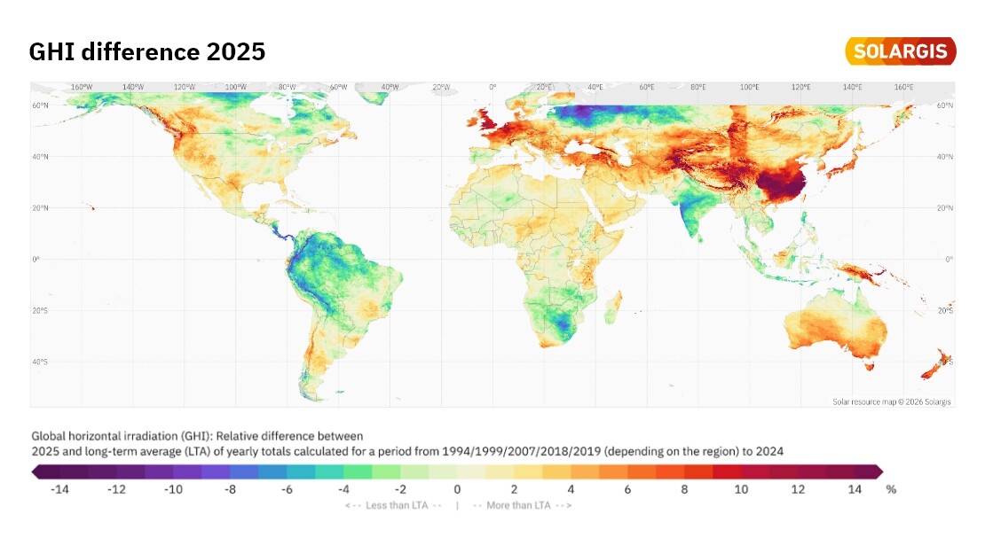
As every year, we bring you a map summarizing last year’s global horizontal irradiation (GHI) anomalies, highlighting how much regional weather conditions diverged from long-term averages (LTA). These maps help project developers, asset managers, and investors understand how atmospheric variability may have influenced PV performance worldwide.
It is widely accepted that high-standard pyranometers operated under rigorously controlled conditions are to be used for bankable performance assessment of photovoltaic (PV) power systems.
At Solargis, we’ve just released Solarmaps: a new solution designed to empower PV power plant portfolio managers, operators, and analysts. Solargis Solarmaps provides timely and accurate insights into the monthly availability of solar resource, air temperature, precipitation, and wind speed: key factors that influence PV power plant performance.
This innovative Solargis Monthly Report enables portfolio managers and PV site operators to optimize operations and deliver clear insights to board members, senior management teams and C-suite decision makers about the performance of their PV projects.
Depending on the source and desired application, solar data can have distinctive temporal resolutions, such as sub-hourly (1-, 2-, 5-, 10-, 15-, 30-minute) or hourly intervals. But how are you supposed to know the difference, and why should you care?
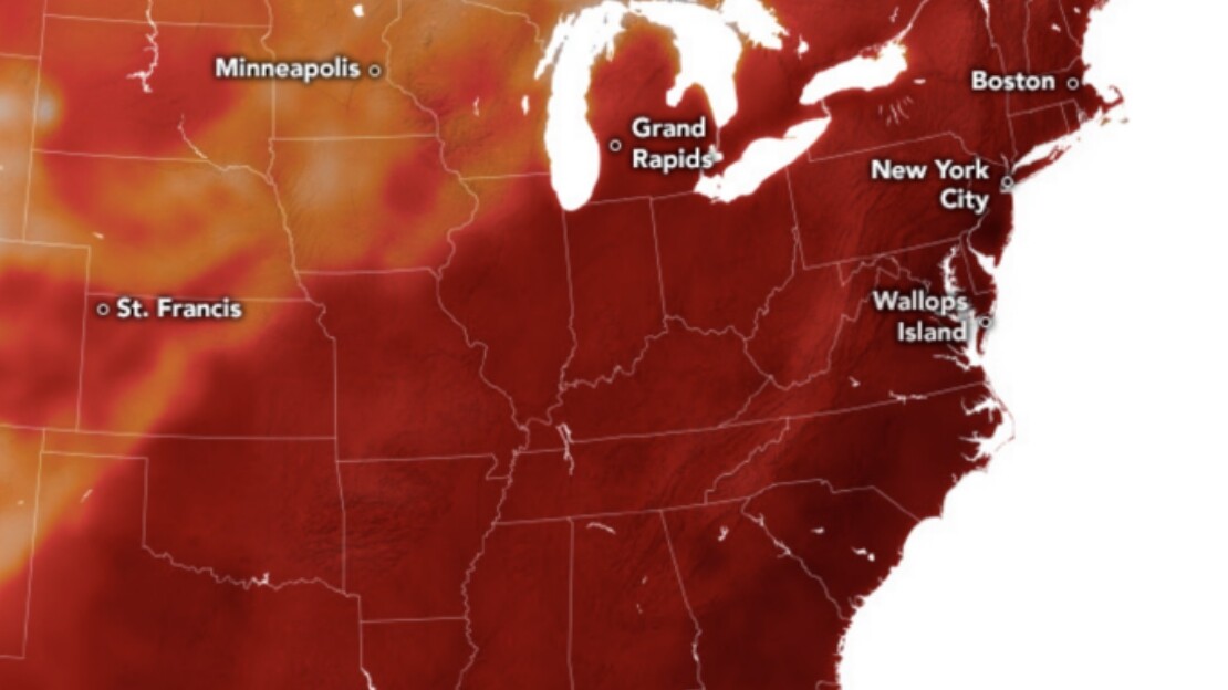
The recent heat dome that enveloped large parts of the Midwest, Northeast and Southeast of the U.S., including states like North Carolina and Maine, has exposed vulnerabilities in the operational and trading strategies of utility-scale solar projects. These extreme weather conditions had direct operational consequences.