本页未翻译。您正在浏览的是英文版本。

Juraj Beták
Oct 27, 2025
When prospecting and evaluating solar projects, most attention goes to Global Horizontal Irradiation (GHI). It is the most widely used metric for solar resource assessment and the basis of nearly every PV feasibility study. But GHI is only one of the many parts of the picture.
At Solargis, we go deeper. Our multidisciplinary team includes more than 30+ PhD-level experts with backgrounds in geoinformatics, cartography, meteorology, and electrical engineering. This unique blend of disciplines means we don’t just process raw data; we combine it, interpret it, and give it new meaning and value for our customers.
That’s why our proprietary solar maps, based on high-quality satellite and model data, reveal much more than GHI alone. They show how clouds, aerosols, seasonality, and both short- and long-term fluctuations affect solar resource availability, and to what extent these factors put your PV project at risk.
Observing these patterns on maps is essential, because a well-constructed map grounded in science gives immediate context: where the solar resource is stable, where it fluctuates, and where developers need to adapt their technology or financial planning.
In Solargis Prospect, we provide a rich set of global maps beyond GHI. Here I highlight four particularly useful map layers that help PV developers and operators understand the complexity of solar resource.
This map shows the ratio of diffuse radiation to global radiation – in other words, how much of the incoming solar resource is scattered by clouds or atmospheric particles (pollution) versus arriving directly from the sun.
In weather forecasts, people are used to watching satellite animations of cloud movements. But to understand a year’s worth of cloudiness, you would need to examine thousands of images. The D2G map does this work for you, quantifying where diffuse conditions dominate.
For PV developers and operators, this matters because different PV module technologies respond differently to diffuse light. While all modules perform best under direct irradiation, some technologies are better tuned for cloudy atmospheres. Compare e.g. Central Spain with east Ecuador, both regions have similar GHI, but there is much more diffuse part of irradiation in Ecuador. D2G ratio may inform whether a given technology will perform more consistently.
Choosing the right mounting system for a solar power plant can also benefit from D2G irradiation data. In areas with strong direct sunlight, tracking systems can significantly boost energy yield. Conversely, in regions where diffuse light dominates, simpler fixed-tilt systems with lower angles are often more cost-effective.
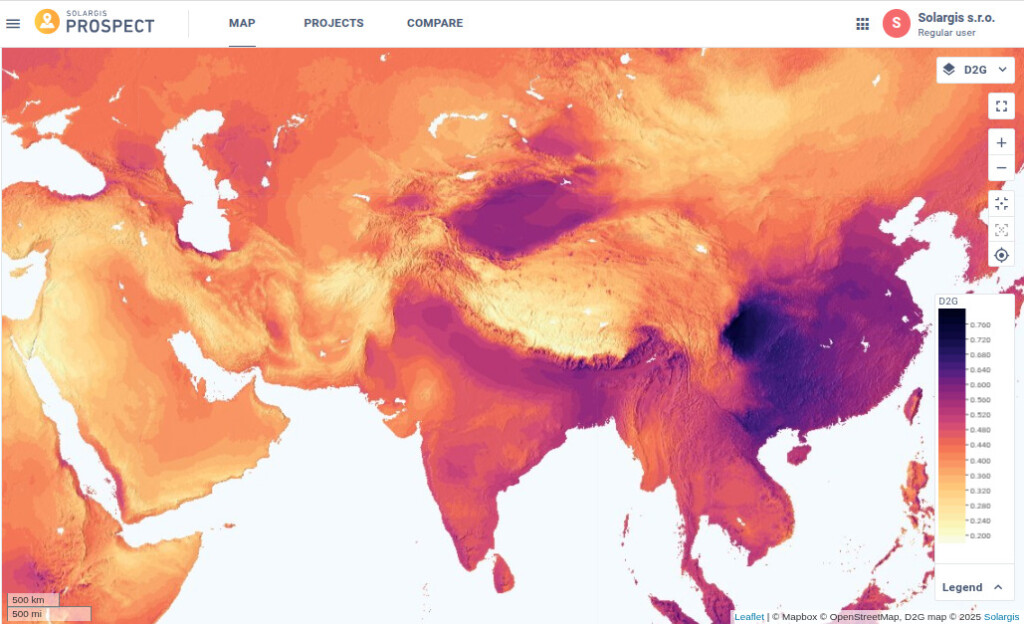
Ratio of diffuse to global irradiation (D2G): The D2G ratio varies notably across regions. Elevated values are observed e.g. in Southeast China, with peak ratios in the Sichuan Basin (dark red-violet colors). In contrast, areas such as the high-altitude Tibetan Plateau and arid regions of the Middle East show consistently low D2G values (bright yellow colors).
This map is best interpreted at a regional scale rather than zoomed in to a single city. It captures the “big picture” of cloudiness and atmospheric scattering, helping developers anticipate performance across broader geographies.
How much does solar resource change from year to year? The long-term variability map provides the first approximation to this question. From the annual GHI time series we calculate relative standard deviation for every spatial pixel globally and transform data into a map.
Values below 2% indicate very stable regions, where annual solar resource typically does not deviate much from the long-term mean. In such places — like Northern Africa or parts of the Atacama — developers can be confident that each year will deliver roughly the same resource.
By contrast, values above 5% signal high variability. In the regions like Germany, Balkans, East Australia, for example, we observe annual swings as large as ±12%. That means a PV project with identical hardware and design might generate 15-25% more electricity one year compared to another.
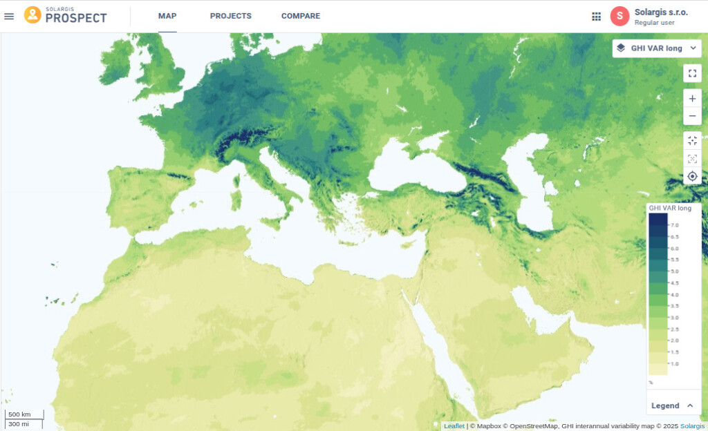
Year-to-year variability in global horizontal irradiation (GHI) is considerably higher in regions such as Central Europe (dark blue-green colors) compared to North Africa or the Middle East (bright yellow colors).
For investors, this metric is critical. It helps distinguish between regions where revenue forecasts can rely on narrow ranges, and those where financial planning must account for wide interannual fluctuations. Evaluating performance after the first or second year must therefore be contextualized: was it an average year, or an outlier within a highly variable climate?
While long-term variability addresses interannual risk, short-term variability focuses on the ramping effects, typically from moving clouds, within minutes or hours. This map quantifies how often solar irradiance changes abruptly in 15-minute snapshots – by 300 W/m² or more.
These ramps matter because they directly translate into intermittent PV generation. In places like Nicaragua or eastern Australia, intermittent cloud cover can cause constant fluctuations, complicating grid integration. In contrast, on the Chilean Altiplano, ramps are rare, and daily production is highly predictable.
This is the first global map of its kind, and it helps move the debate on PV “intermittency” from vague concerns to measurable patterns. Developers can see where short-term variability is a serious operational issue and where it is negligible.
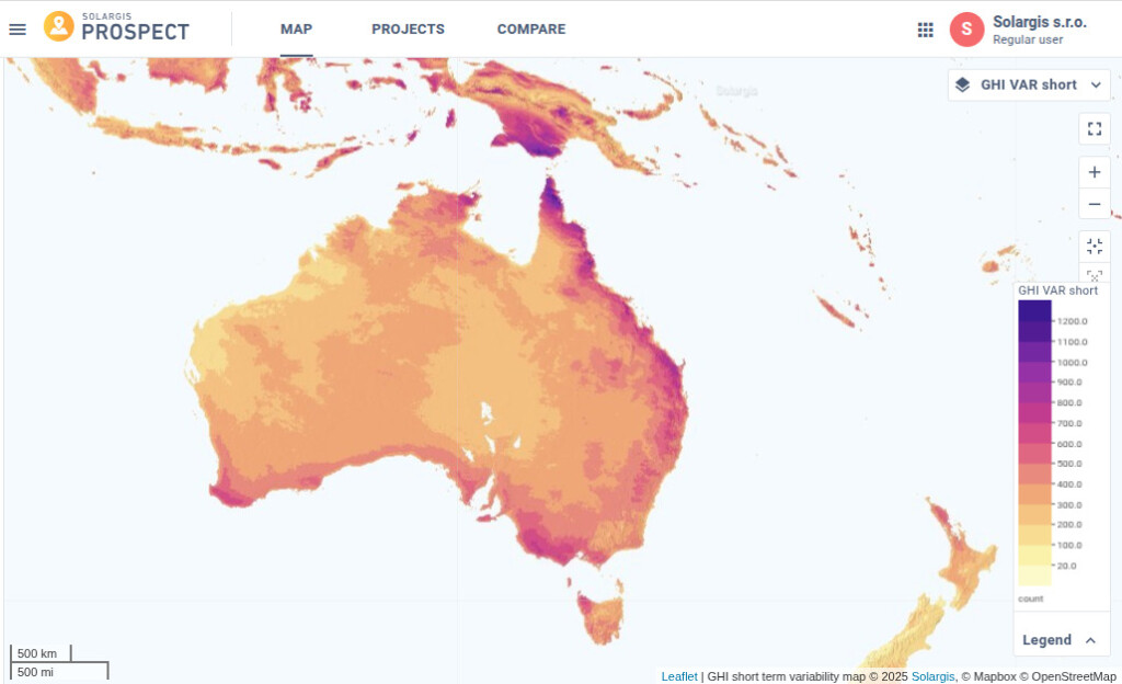
In Australia, higher occurrences of solar ramp events are observed along the northern, eastern, and southern coasts (dark red-violet colors). In contrast, central and western regions experience significantly fewer events—approximately two to three times less frequent (bright orange colors).
For operators managing portfolios, the map also guides decisions about plant size and siting: in highly variable regions, smaller distributed plants may balance generation more effectively than a single large installation.
Finally, the seasonal variability map compares the month with the highest solar resource to the month with the lowest. This ratio quantifies how much stronger one season is compared to another.
In northern Europe or northern Canada, values can exceed 8, meaning that December receives up to eight times less solar resource than May or June. The winter season cannot rely on much electricity from PV generation; however, due to significantly longer days in the summer months PV output in Northern Europe can compete with subtropical regions.
By contrast, southern Spain records ratios around 2.5, translating into PV output variability of roughly 1.7. In these regions, solar can realistically serve as a primary year-round energy source.
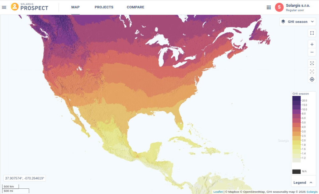
GHI Seasonality and Latitude Dependence: In North America—as in many other regions—global horizontal irradiation (GHI) seasonality is strongly influenced by latitude. GHI levels tend to be lower near the Equator (bright yellow colors) and increase progressively toward higher latitudes (dark red-violet colors).
Understanding seasonal variability is crucial for grid planning and energy security. It underscores why solar in Central Europe must be paired with wind or storage, while in subtropical regions it can stand as a more consistent backbone of the energy mix.
Together, these four maps – D2G, GHI long-term variability, short-term variability, and seasonal variability – address the most common concerns of PV stakeholders: cloudiness, year-to-year swings, intra-day stability, and seasonal gaps. They extend far beyond simple GHI averages and allow for a deeper, scientifically grounded understanding of solar risk.
For developers and investors, combining insights from these maps helps answer fundamental questions: What technology should we choose? How stable will revenues be? What risks must be considered in financing and operations? And for policymakers, they provide clarity on how solar can be integrated into diverse regional energy systems.
At Solargis, our mission is not only to deliver precise solar data, but also to provide the visual and analytical tools that make these data meaningful. Maps are an essential part of that journey.


