本页未翻译。您正在浏览的是英文版本。
At Solargis, we’ve just released Solarmaps: a new solution designed to empower PV power plant portfolio managers, operators, and analysts.
Solargis Solarmaps provides timely and accurate insights into the monthly availability of solar resource, air temperature, precipitation (rainfall), and wind speed — key factors that influence PV power plant performance.
In this article, we share what Solarmaps is and how it can support your PV portfolio management.
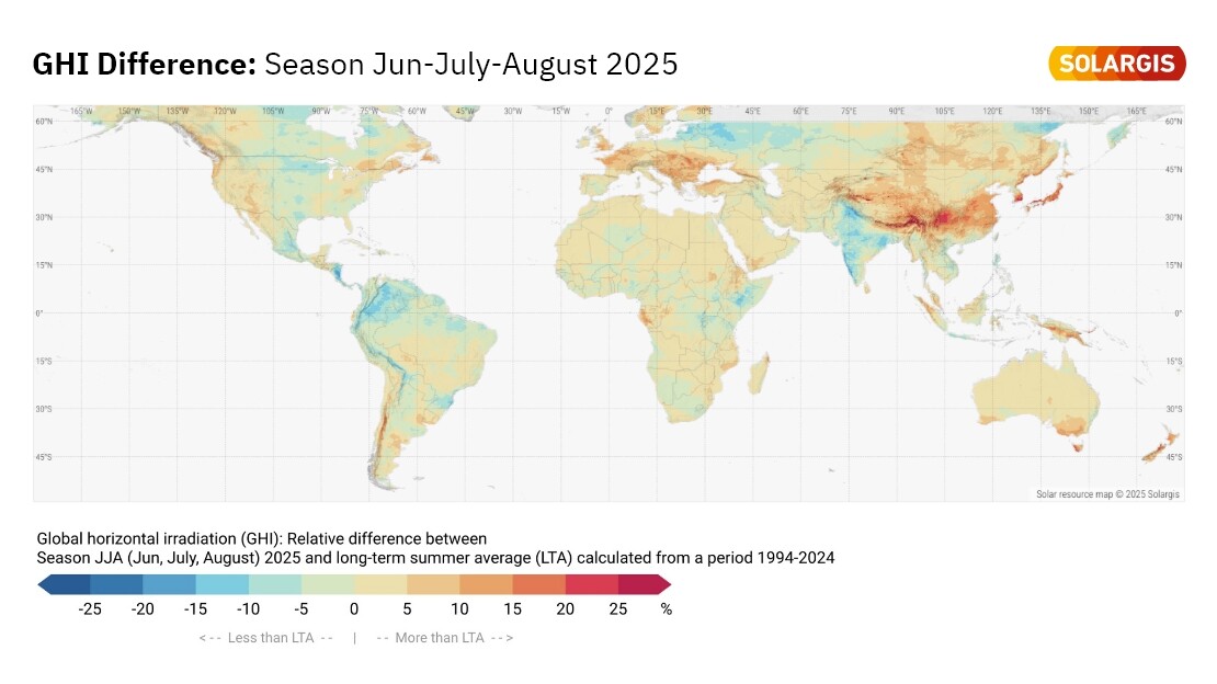
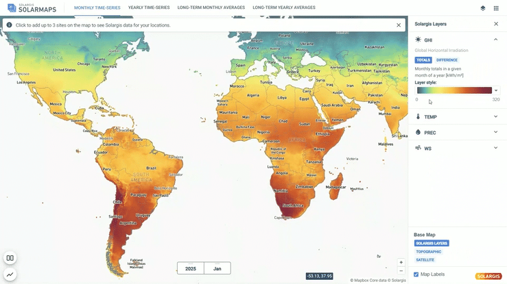
Are you considering environmental effects in your PV plant performance evaluation? When performing an initial diagnosis of PV asset performance, the Solargis Solarmaps interactive map offers a complete geographical context of solar and meteorological events. This helps you understand whether your PV system performed in line with actual weather conditions, enhancing transparency and accountability in PV asset management.
Solarmaps allows you to pinpoint specific weather-related events and link them to your PV plant’s performance in the previous month. You can either explore a world map overview or select a precise location (up to three sites) to access localized data.
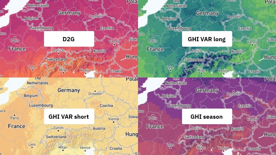
In the upper banner of the Solarmaps interface, you’ll find tabs displaying different data aggregations. Depending on the selected tab, the map layer updates to show the corresponding values.
For the latest month and the latest calendar year:
Long-term monthly and annual averages:
When new data for a recent month becomes available, the existing monthly dataset will be replaced with the most recent month. At any given time, only data for the previous month is accessible.
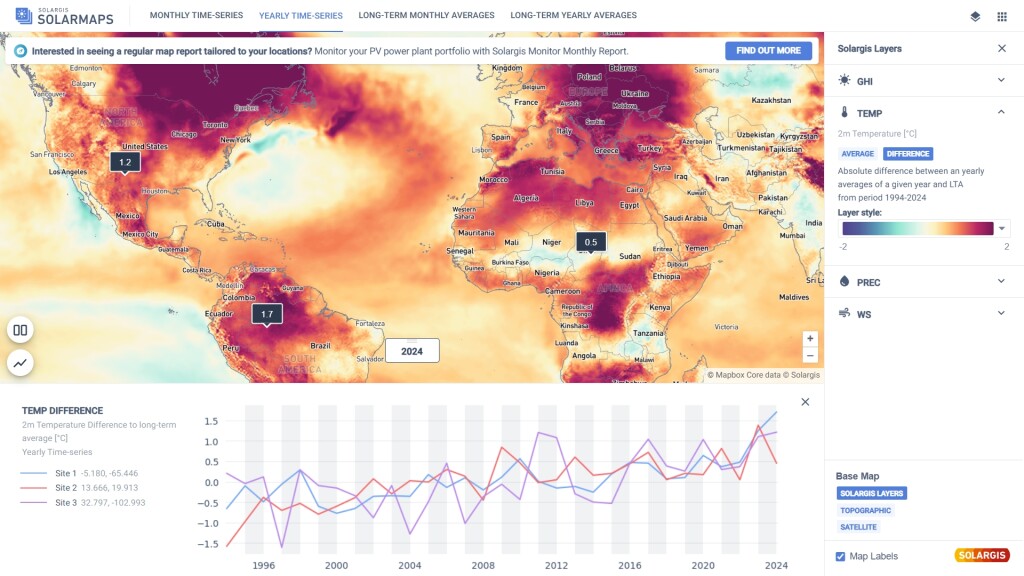
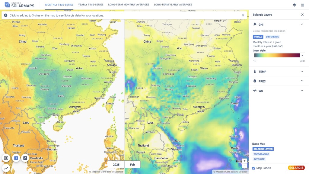
To view precise, site-specific data for the previous month, simply click on the map to locate your projects. You can select up to three sites at once. Values for the previous month can be compared with long-term averages, helping you attribute deviations in performance to environmental conditions.
The same applies to yearly data. Simply switch the tab in the upper menu from monthly to yearly time-series to access last year’s values.
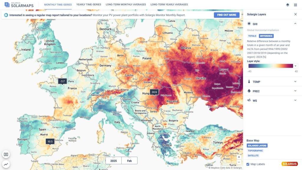
Once a map layer is selected, you can customize the color scale for the selected parameter for better visualization. This helps highlight areas that are in line with your desired range. To adjust the range, edit the values under the Style section on the right-hand side.
With the split view feature, you can divide the map window into two panels and compare selected variables side by side. This allows you to analyze the correlation between monthly air temperature and GHI in one screen and assess its impact on monthly PV performance.
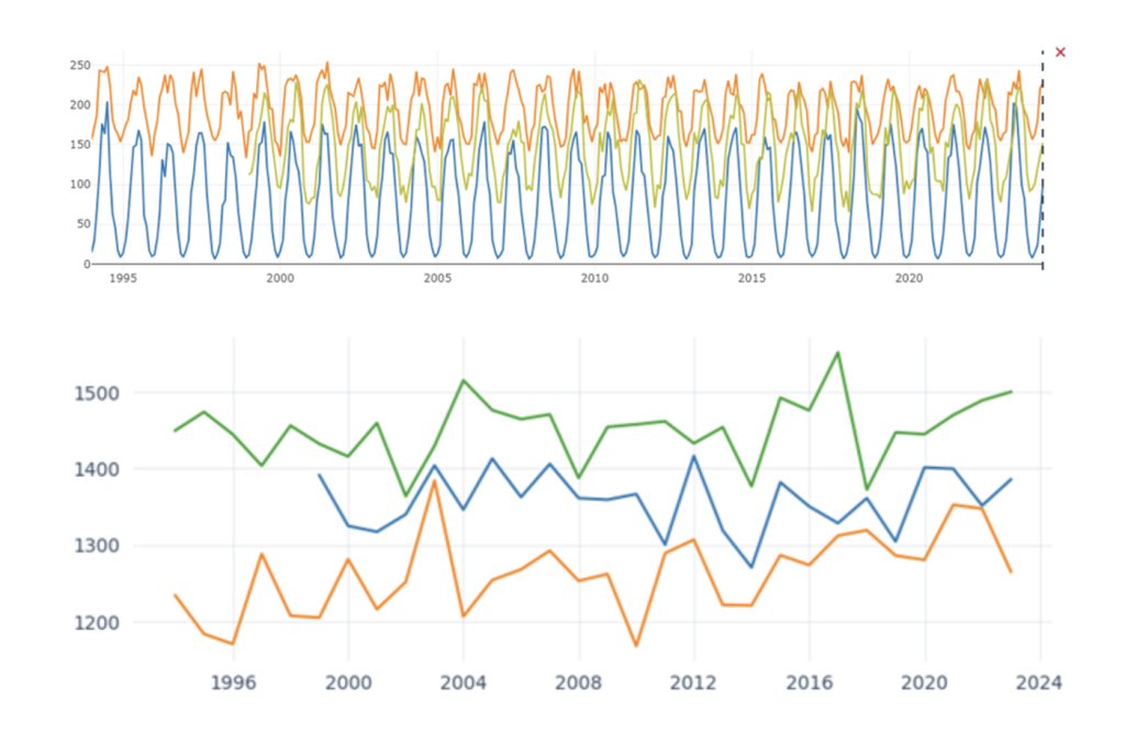
You can select up to three sites and display them in a graph to visualize the full history of monthly or yearly time series data. This makes it easy to spot cyclic changes and seasonal trends. Graphs can be exported in PNG format with a simple right-click for use in reports and presentations.
Only Solargis customers can get access to Solargis Solarmaps. The application is automatically available to anyone with an active subscription to any Solargis solution.
Access your account here: https://apps.solargis.com/